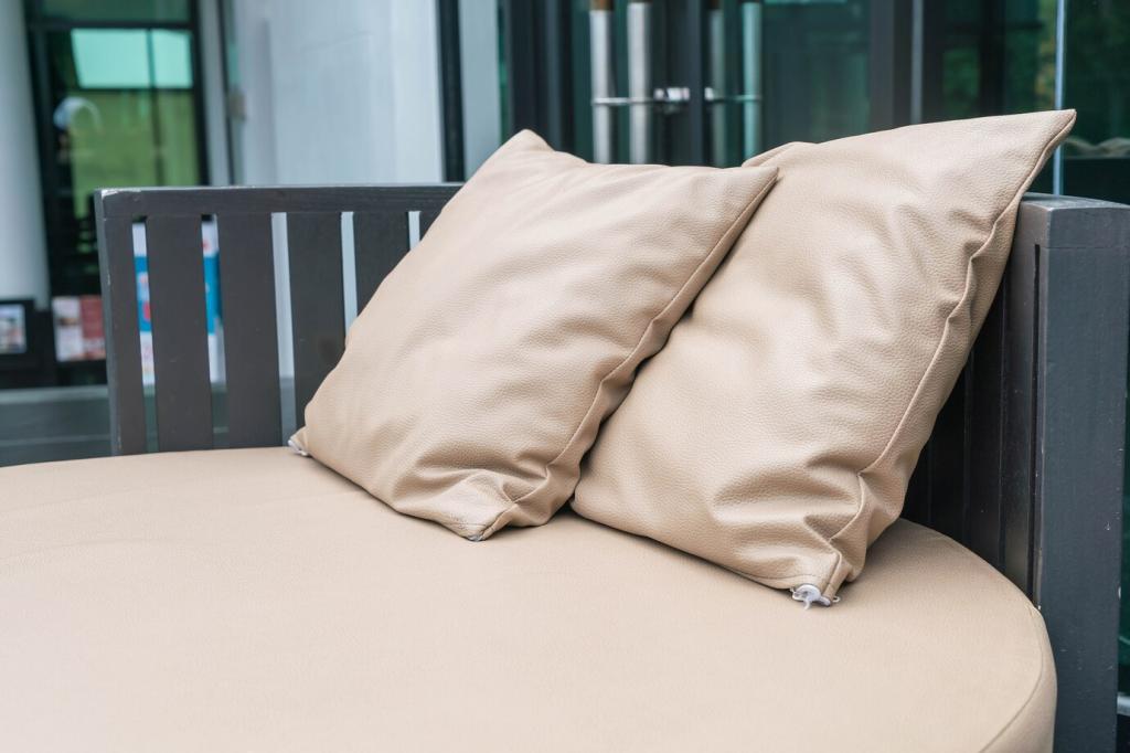
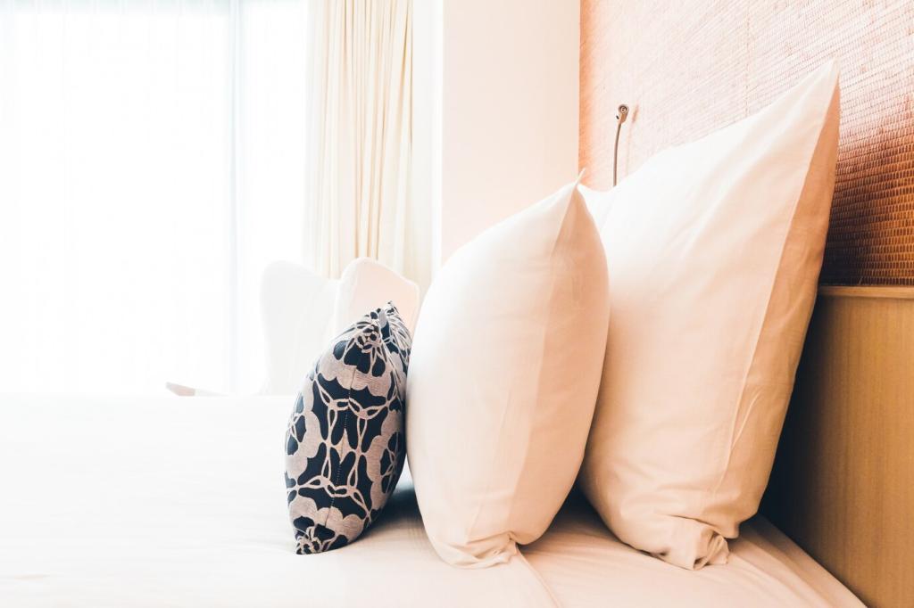
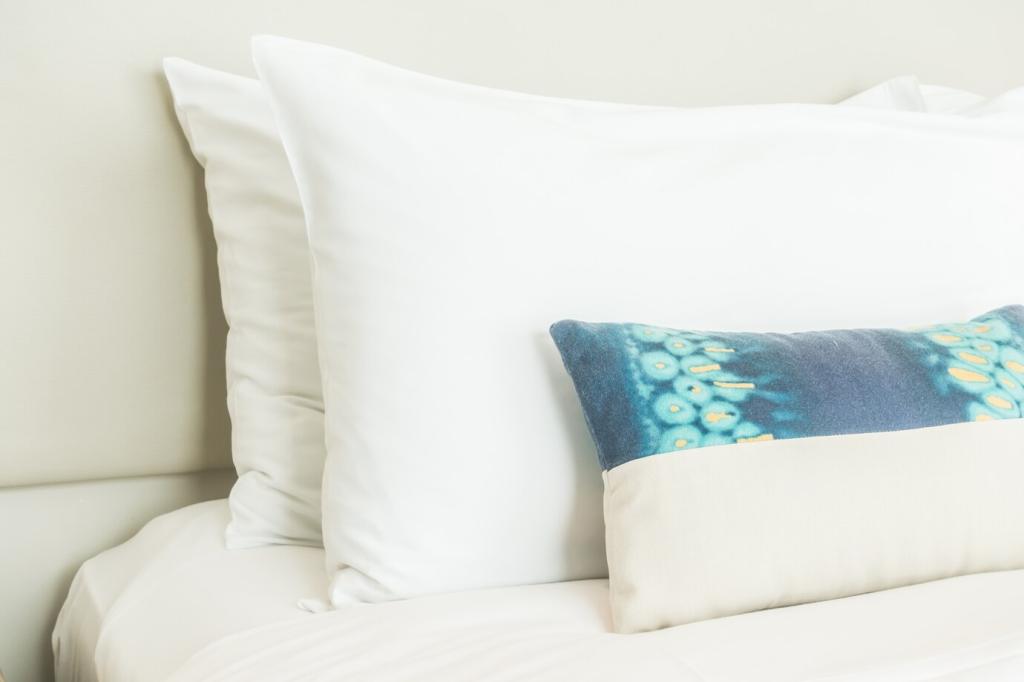
Chosen theme: Creative Color Schemes for Bespoke Pillowcases. Welcome to a cozy corner where color tells stories you can sleep in. From calming pastels to jubilant brights, we explore palettes that turn pillowcases into tiny canvases of comfort. Join us, share your palette ideas, and subscribe for weekly color inspiration.
Warm colors like terracotta and peach feel welcoming, while cool tones like misty blue and eucalyptus soothe the mind. Mix them thoughtfully: pair a blush pillowcase with a soft slate companion to keep warmth without overstimulation. Tell us: which side of the spectrum helps you unwind at night?
Imagine first light over quiet waves: seafoam greens, pale sand, and a whisper of coral. Use seafoam for the main pillowcase, sand for the back panel, and coral as delicate piping. The result feels breezy and optimistic. What ocean hues would you blend for a soft, sunrise-ready set?
Ground the bed with moss green fronts, add bark brown edging for definition, and sprinkle fern-printed accents for movement. This palette pairs beautifully with linen textures and wooden headboards. If you have plants nearby, the tones echo naturally. Send us a photo of your green nook; we may feature it.
Borrow warmth from long horizons. Adobe creates a gentle base, burnt sienna offers shadowed depth, and faded lilac brings unexpected softness. Try a color-block pillowcase: broad adobe panel, thin sienna band, lilac envelope closure. Save this palette for winter nights when you crave color-driven coziness.
Textures, Fabrics, and the Way Color Behaves
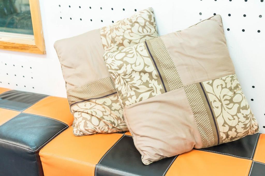
Monochrome, Upgraded Through Texture
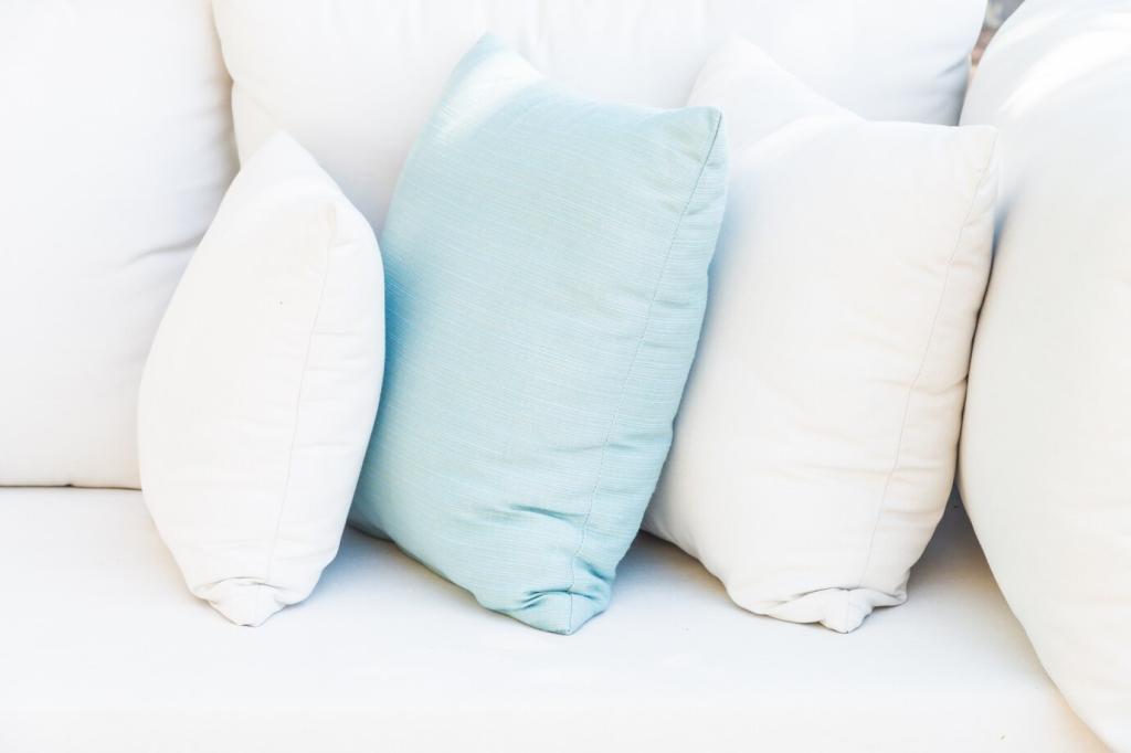
Choose one hue—say, cloud gray—and vary the texture: sateen front for sheen, percale back for cool crispness, and linen flange for artisanal softness. The single-color plan feels curated, not flat. Tell us your monochrome crush and we’ll suggest texture pairings tailored to your climate and sleeping style.
Matte vs. Sheen: Managing Light at Bedtime
Matte fabrics absorb light, making dark tones feel plush and quiet, while sateen reflects light, brightening even muted colors. Combine matte main panels with a subtle sheen trim to guide the eye without glare. Prefer a dark, cocooned vibe? Go matte-on-matte, then add contrast with stitch detailing.
Dyeing, Detailing, and Finishing Techniques
Dip-dye from pale to saturated within the same hue to reduce visual clutter while keeping interest. Sky blue fading to twilight blue frames the face softly. Test on scraps first for timing and evenness. Want our ombré timing chart? Subscribe and we’ll send a printable, step-by-step guide to your inbox.
Seasonal Color Calendars for Year-Round Joy
Pair whisper pink or eggshell with herbaceous greens—mint, basil, and celery—to create lightness without sugariness. A striped accent pillow links tones seamlessly. It’s a gentle reboot after winter. Tell us your local spring colors, and we’ll suggest a regional palette that mirrors your landscape.
Seasonal Color Calendars for Year-Round Joy
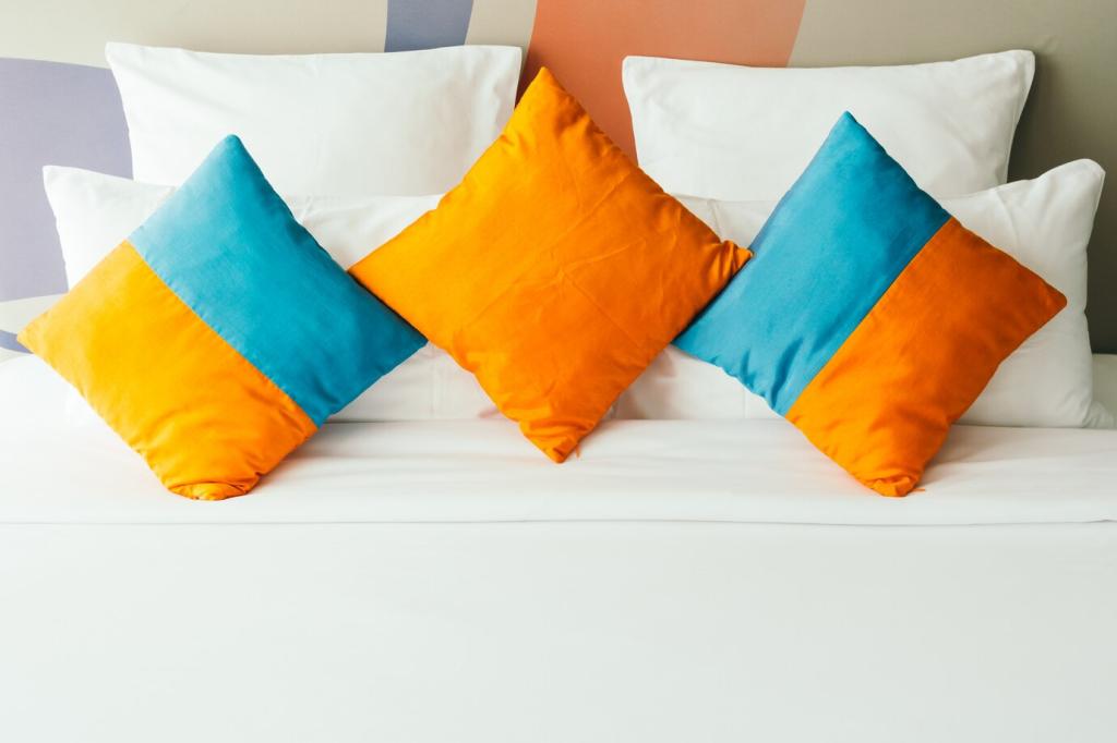
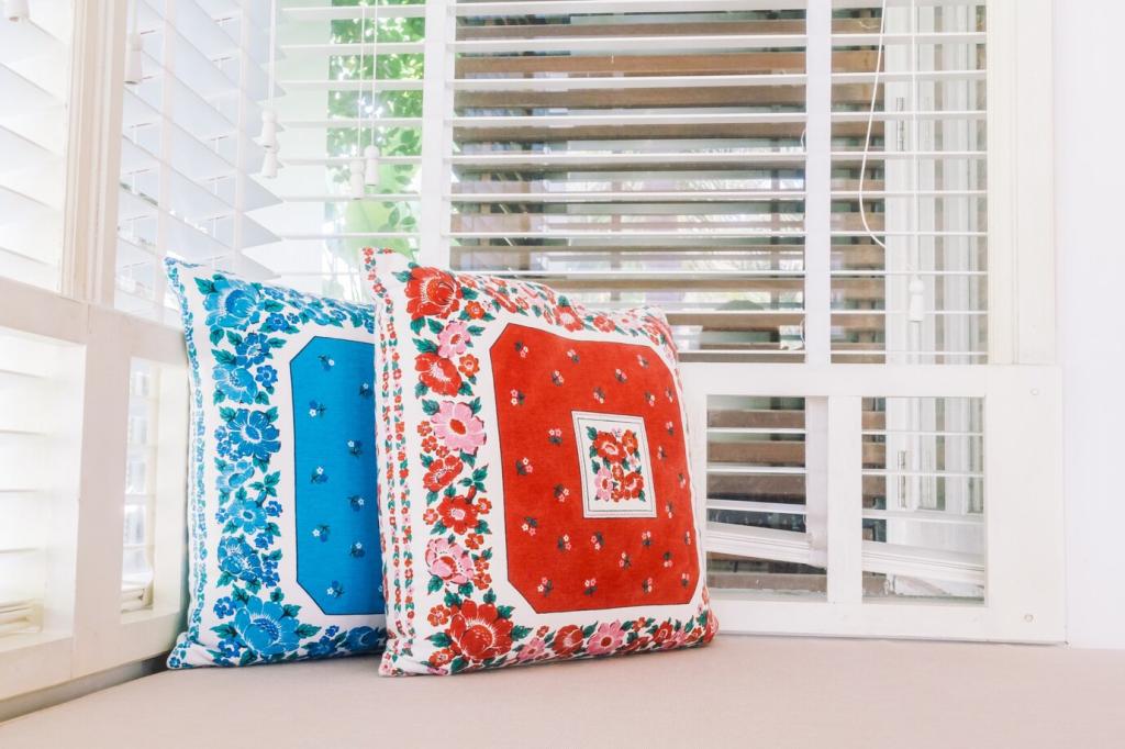
Citrus tones feel energetic, perfect for rooms with abundant light. Use cream pillowcases as the base, then layer lime shams and a tangerine accent case. Balance brightness with natural fibers for breathability. Vote in our poll: bold citrus or soft tropical? Your responses guide next month’s palette stories.
Keeping Colors Vibrant: Care, Testing, and Longevity
Colorfastness Checks Before First Wash
Dab a hidden seam with water and mild detergent using a cotton swab, then blot with a white cloth. If color transfers, wash gently alone in cool water with a dye-catcher. Pre-testing saves heartbreak. Comment with fabric type and dye method for tailored care guidance from our community moderators.
Smart Washing to Prevent Fading
Turn pillowcases inside out, use cool water, and choose a gentle detergent without optical brighteners that can distort colors. Skip over-drying; heat bleaches vibrancy over time. Line dry in shade when possible. Subscribe for our printable laundry card designed specifically for colored linens and delicate trims.
Sunlight, Storage, and Rotation
Prolong life by rotating sets seasonally, storing in breathable cotton bags, and keeping them out of direct sun between uses. If your room gets intense afternoon light, consider deeper hues on the back panels. Share storage hacks that keep your palette pristine; we’ll highlight clever ideas in our newsletter.